


We live in a data world: smartphones, Internet of things devices, remote sensing, cameras, wireless sensor networks and radio-frequency identification readers are just a set of devices that produce a massive quantity of data. Digital Transformation pushed by Industry 4.0 and the COVID-19 outbreak pushed data production even further. To give a few numbers, the global data volume has grown exponentially from 4.4 zettabytes to 44 zettabytes between 2013 and 2020, as predicted in a report of International Data Corporation (IDC)[1].
The problem here is that we as human are not good in interpreting this data. On average we are bad in statistic, we are biases prone and our brain is lazy when there is the need to crunch numbers. In other words, our brain is not the best tool for data analysis. Fortunately, we have other tools that is able to take as input a large amount of data and filter only the relevant information. These tools are able to filter what is relevant and what is not with a minimum effort, without even the need for us to think about it. The tools that we are talking about are our eyes. Using this mean, we are able to use graphical representation of data, in order to make sense of them.
In this B4DS Notebooks, we aim to provide a definition of what Data Visualization is and to introduce a framework to help data analysts and data scientists being a good data visualisation designers.
[1] Reinsel, David; Gantz, John; Rydning, John, ”Data Age 2025: The Evolution of Data to Life-Critical” (PDF). seagate.com. Framingham, MA, US: International Data Corporation. Retrieved, 2 November, 2017
What is Data Visualization?
Data Visualization can be defined as the process of representing data by means of graphics. It can be seen as a powerful tool of discovery, whose purpose is to represent data in a way that exploits visual perception to amplify cognition.
It is important to notice that representing data graphically does not mean simplifying them but allowing users to see them under a different light, to observe patterns and exceptions and to discover stories that may be hiding behind the raw data. Data Visualization helps making data more accessible, understandable, and usable. Thus, the goal is to communicate information clearly and efficiently to users.
Even though its roots may be found in Descriptive Statistics, its use may be of interest for many different professions and jobs. Anyone who is interested in showing data in a more intuitive and familiar way to some audience may want to know how to achieve its purpose in the most effective way.
Make the Design of your Data Visualization Dynamic
Design a good data visualization may be tricky and not as simple as it seems, but thanks to few suggestions and rules it is possible to obtain a good and satisfactory result. We decide to publish a series of B4DS Notebooks on Data Visualization for helping people to know the basic rules for designing a satisfactory graphical representation of data.
Let’s start with the first rule, which says: “Keep an eye on the staircases. They like to change.” For those who are fans of Harry Potter this quote may be familiar, for those who are not let’s just say that in the first book of the saga, the students, during their first visit to Hogwarts School – a school of wizards – are warned about the peculiarity of the castle’s stairs, which change direction at will and can take them to different parts of the castle than the ones they were heading for.
With this first rule we want to emphasise that Data Visualization is not a fixed and immutable process, but it is, instead, an alive process, subject to continuous changes and corrections along the various steps. That’s why the “magic” quote!
The design of a good Data Visualization is all about choices. It is important to remember that there will never be a single possible route to the best solution, and that is because the “best” solution does not exist! However, there is practical and theoretical evidence to help understand which techniques work best in some situations and worst in others.
The ultimate aim is therefore not to chase the only optimal representation possible but to obtain and produce a visualisation that takes into account different aspects, which are described by the other rules, explained more deeply in future notebooks.
If you want your Data Visualization to be good, effective, accurate and beautiful, you need to ask yourself a lot of questions during the path, so to continuously adjust your work, modify the choices you already made and improve your result.
A scheme that helps understanding the underlying idea is shown in Figure 1.
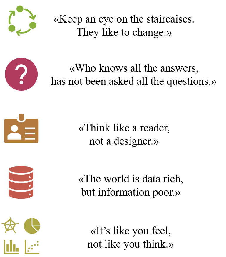
Figure 1. Scheme of the rules for Data Visualization.
The role of this first rule is to emphasise a continuous improvement of the steps already done and those yet to be done, always asking new and challenging questions. In fact, as we will see, each step can, and must be, subject to continuous adjustments until the most useful information is obtained on the basis of which the best visualisation can be constructed. The process described through the rules is intended to suggest a “trial and error” approach.
The aspects and rules that will be described in future articles are the following:
- “He who knows all the answers, has not been asked all the questions.”: To obtain a good result it is important to define right questions to answer trough the proposed visualization.
- “Think like a reader, not a designer.”: Everyone is different, and it is important to offer different tools to different people. Thus, it is fundamental to know well the audience you are talking to.
- “The world is data rich, but information poor.”: Data are the pillar of data visualization, that’s why it is fundamental to give necessary care and attention to them.
- “It’s like you feel, not like you think.”: Finally, offering the readers a good visualization means finding the correct and most appropriate tools for their brains. Seeing and understanding are interrelated processes, people understand because they see.
All the rules are connected and strictly interrelated to each other, meaning that a good data visualization needs the cooperation of all the above aspects. A good graph cannot be a good one if it isn’t understandable by its audience, if it aims to answer too many questions together, if it uses colours and shapes that mislead its readers, and so on. Correct data visualisation requires continuous integration between the different steps.
Besides, the output of each rule affects and is affected by the outputs of the other rules, in a chain relationship which must be indissoluble but flexible. Each result obtained from the individual steps can be used to revise, modify, and improve the previous and subsequent ones in a circular and continuous improvement approach, in order to derive maximum benefit from each new information and specification obtained from them.
Lastly, in Figure 2 we want to show you an example of a wrong data visualization. Even if, at a first glance, the graph may seem good and technical, it presents several errors, some more serious than others. Can you identify any of them?
In the next B4DS Notebooks we will analyse together which are the mistakes in this example and we will also give you some hints to improve the visualization.
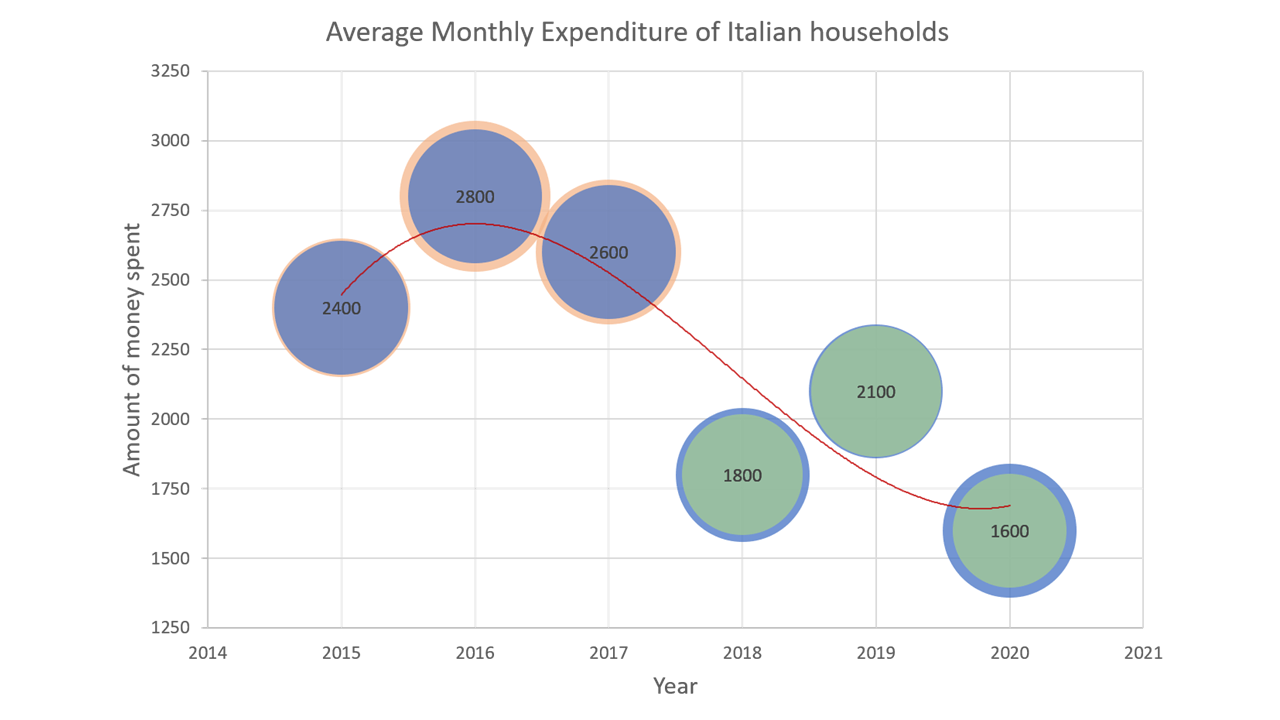
Figure 2. Example of a wrong Data Visualization. Note: Data used in the graph are fictitious and created for illustrative purposes only.
In the future notebooks we will explain in more detail each rule, focusing on how to enhance your data visualization in practice. The next article will focus on designing the message you want to communicate, namely “He who knows all the answers, has not been asked all the questions.”
By Valentina Sale, Filippo Chiarello e Vito Giordano