


As we said in our first notebook, the world we live in, is a data world, where devices, digital transformation and the current COVID-19 situation pushed the production and the storage of a huge quantity of data. But, what about this data? How can we, as humas, gather information from it? How can we benefit from all this data? How can we efficiently manage it?
In our first notebook (The Magic of Design in Data Visualization) we also stated that, as humans, we are not good enough in interpreting data, due both to our inability to do statistics, to biases that affect our perception, and to the laziness of our brains. There is, in addition, another problem concerning data, which is the main topic of this fourth notebook!
The quote we want you to focus on is the following: “The world is data rich, but information poor.”!
The concept of data rich and information poor (DRIP) was firstly used by Tom Peters and Robert H. Waterman Jr. in their book “In Search of Excellence”, published in 1982, which has been a must-have for business users for a long time. What the authors meant was that in the business world existed a gap in the processes of producing meaningful information from data to create competitive advantage. It is confirmed that data can add enormous value only if we know where the data fits.
The basis of correct data visualization is data itself. In this context it is the absolute star and must therefore be given the necessary care.
Knowing the data available means identifying, among the others: type, trend, size, extent, integrity, completeness, cleaning.
Studying the available data is a fundamental activity since the data we may have found is not always consistent, clean, or even intact. Failure to pay the needed attention to this step may lead to misunderstandings or even misinterpretations. Additionally, because of a careful data manipulation, you may also identify so far hidden trends or patterns.
As for the previous rules, we want to give you a schematic set of steps to follow:
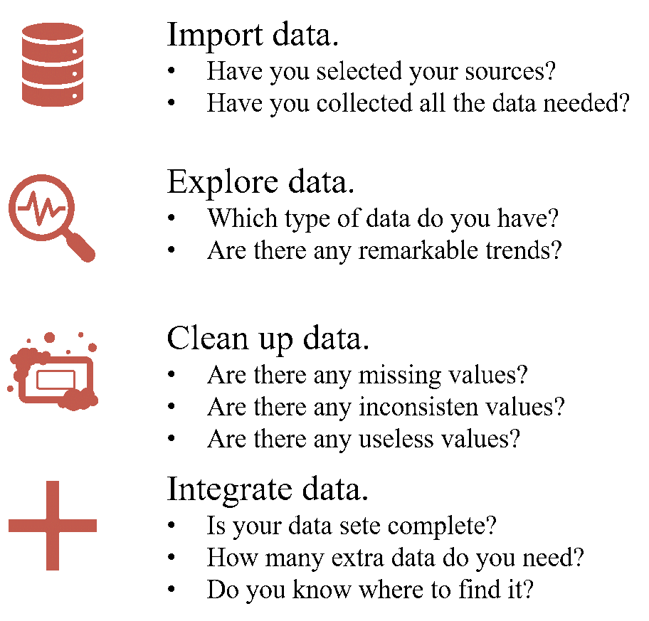
Figure 1. Step to follow.
The first step concerns the collection of the data you will need to produce the representation. In this phase it is important to clarify which data you are looking for and which are the most suitable sources to look into. It is possible that you will not find all the data needed in a single source, while you may have to search among different ones.
Once you have completed the data collection, you can proceed by exploring it to find out which types of data you have, if there are any remarkable trends, the size of the data, the extension of it and if there are any outlier. This step is defined as Exploratory Data Analysis (EDA), through which you should be able to understand if the data you imported suits your purposes.
It is important to notice that the second step may be iteratively made once you have cleaned up data, until you reach a satisfactory data frame.
The third step is a fundamental one. Data cleaning, indeed, concerns detections and correction of inaccurate records. It starts with identification of incomplete, incorrect, inaccurate, or irrelevant elements of the data to be replaced, modified, or even delated. Cleaning up your data allows you to uncover hidden trends or information, leading to a new phase of analysis and discovering. You need to make your data frame consistent, intact, and obviously, clean.
The last step is not compulsory, you may or may not need to make it. After analysing, cleaning, and analysing again your data, you may recognise the need to add data in order to complete or integrate yours.
Remember that you collect data to the final purpose to offer answers to questions your audience may have. When you process it, try to think in advance to the answers you may offer through it, if the data is understandable by your audience and if it is clear, complete, and precise enough to satisfy your goals. While proceeding through the various steps and rules, don’t forget the steps you have already made and always try to integrate and chain all of them, pursuing the circular approach we suggested in the first notebook.
No more chitchat for today! Let’s see some examples of the steps abovementioned concerning the visualisation we proposed in the previous articles.
Just pick up on some of the questions we were looking for answers to through our visualisation:
- “How the expenditure of Italian households changed in magnitude”?
- “What time trend followed the average monthly expenditure of Italian households?”
With these questions in mind, we have to find the necessary data to answer them precisely, so to be able to produce our plots:
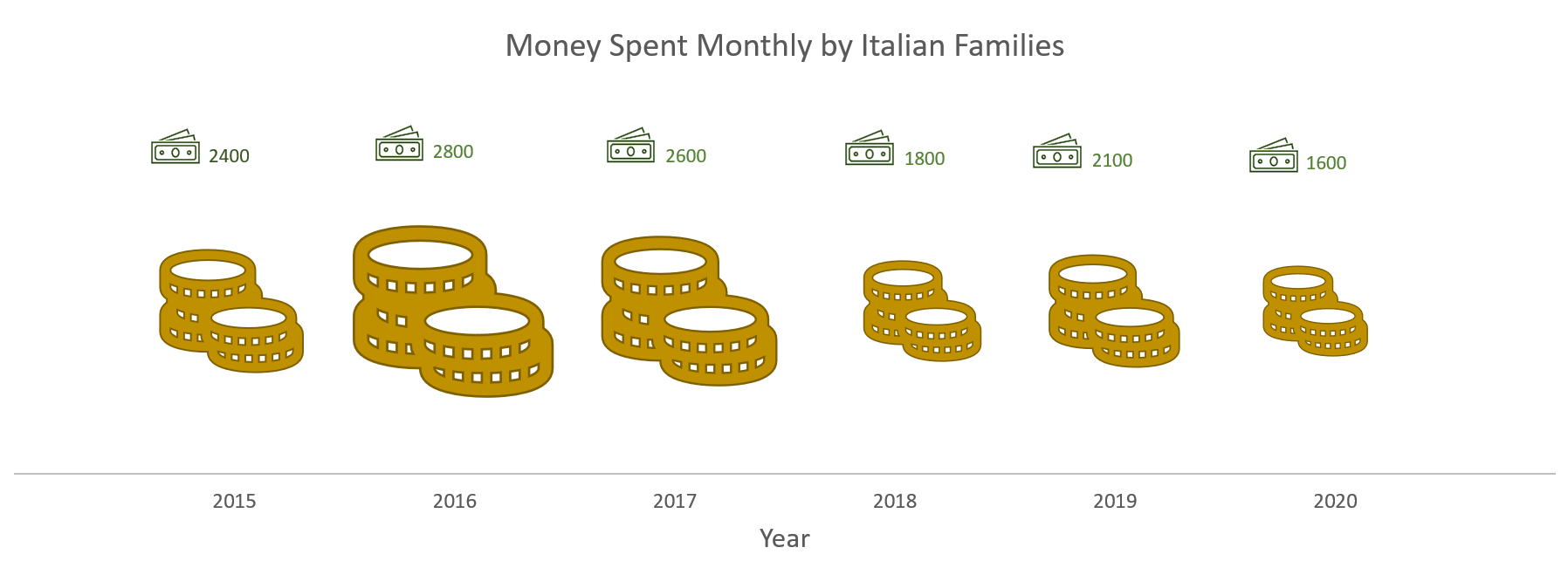
Figure 2. Plot showing money spent over years by Italian families.
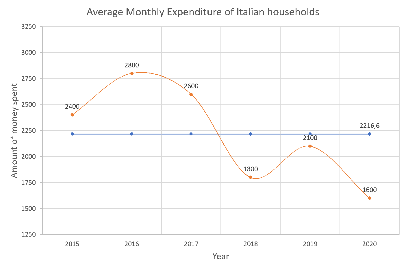
Figure 3. Plot showing trend over time of Italian households’ expenditure.
If we want to show our audience the changes in magnitude and the time trend of Italian households’ expenditure we need, alternatively:
- Data of Italian households’ expenditures aggregated by Country;
- Data of Italian households’ expenditures aggregated by Region or City to be summarised in order to obtain the data aggregated by Country;
- Data of Italian households’ expenditures already aggregated by year;
- Data of Italian households’ expenditures by month, for each year, to be able to calculate the average value by ourselves.
We can now think about the sources where to find data, which in this case may be Istat website.
Let’s suppose we obtained the following data:
| Year | Monthly Average Expediture |
| 2015 | 2.400,00 € |
| 2016 | 2.800 € |
| 2017 | NA |
| 2018 | 1800,00 |
| 2019 | 2.100 |
| 2020 | 1600 |
Table 1. Data collected.
We notice that:
- Data is aggregated by year;
- There is a missing value for 2017;
- Values are not written in the same way.
- There is not collateral information about the phenomenon that may help understanding it.
Thus, data needs to be cleaned, integrated, and aligned.
To this purpose we first need to find data concerning 2017 from another source, suppose we find it and has it in this form:
| Month | Year | Expediture |
| Gen. | 2017 | 2600 € |
| Feb. | 2017 | 2700 € |
| Mar. | 2017 | 2500 € |
| Apr. | 2017 | 2700 € |
| May. | 2017 | 2500 € |
| Jun. | 2017 | 2600 € |
| Jul. | 2017 | 2600€ |
| Aug. | 2017 | 2800 € |
| Sep. | 2017 | 2400 € |
| Oct. | 2017 | 2600 € |
| Nov. | 2017 | 2500 € |
| Dic. | 2017 | 2700 € |
Table 2. Data collected for 2017.
Since data is not aggregated by year, we need to calculate the average value by ourselves, in order to insert it in the table.
Once calculated the average value for 2017, we can insert it in the table and align the way the values are written:
| Year | Average Expediture |
| 2015 | 2.400,00 € |
| 2016 | 2.800,00 € |
| 2017 | 2.600,00 € |
| 2018 | 1.800,00 € |
| 2019 | 2.100,00 € |
| 2020 | 1.600,00 € |
Table 3. Data cleaned, completed, and aligned.
We may also be interested in finding additional information that may help us understanding the phenomenon, giving, for example, an idea of the basis on which expenses have being calculated. To this purpose may be interesting to integrate the information about the overall Italian population for each year.
We may have found something like:
| Year | Overall Italian Population |
| 2015 | 60.795.612 |
| 2016 | 60.665.551 |
| 2017 | 60.589.445 |
| 2018 | 60.483.973 |
| 2019 | 59.816.673 |
| 2020 | 59.641.488 |
Figure 4. Data about Italian Population over time.
That, integrated with the previous steps would seem like:
| Year | Average Expediture | Overall Italian Population |
| 2015 | 2.400,00 € | 60.795.612 |
| 2016 | 2.800,00 € | 60.665.551 |
| 2017 | 2.600,00 € | 60.589.445 |
| 2018 | 1.800,00 € | 60.483.973 |
| 2019 | 2.100,00 € | 59.816.673 |
| 2020 | 1.600,00 € | 59.641.488 |
Figure 5. Aggregated data.
Now we are finally able to dig into our data and to plot it to answer the questions we ask before!
We are almost at the end of this journey about the rules to design a good Data Visualization, we just have to wait for the next notebook to discover the last rule, “It’s like you feel, not like you think”.
By Valentina Sale, Filippo Chiarello e Vito Giordano