


In this third notebook on Data Visualization (case you didn’t, please remember reading our previous posts on The Magic of Design in Data Visualization and The Childish Sside of Design in Data Visualization) we want to talk about one of the major experts in Data Visualization, Alberto Cairo, a journalist, graphic designer, and teacher of Visual Journalism at Miami University. In one of his books, “The functional art: An introduction to information graphics and visualization” he wrote the quote we want you to focus before introducing our third rule, which is: “Think like a reader, not a designer.”!
What Cairo wanted to say is that you have to put yourself in the shoes of you readers if you want to give them a good visualization that they are able to understand and appreciate. For a brief period of time, you should abandon your role of graphic designer and try to understand what your audience wants to know, what is capable of understand, which language, which type of information. Just like shoes, plots and visualisations must fit with their owners. Not all the visualisations are good and suitable to all the possible audiences.
Remember that a good visualisation aims at achieving two main goals:
- Presenting information.
- Allowing users to explore that information.
Thus, the complexity of a plot representation should be adapted to the nature of the average target user. Not everyone has the same basic knowledge to be able to read and interpret the same types of representation. In order to enable your reader/interlocutor to draw as much correct information as possible, it is necessary to know him/her well, to understand what tools he/she has and what previous knowledge he/she has on the specific topic. It is also important to ask yourself what users want and can do with the visualisation you offer them.
It is therefore necessary to get to know them pretty well, in this way it will be possible to offer them the most adequate representation.
To help you understanding how to put this rule into practice, we suggest a few steps to follow:

Figure 1. Step to follow.
With the first step we want you to write down a sort of identification card that will help you perfectly understand who your reader is. Each aspect characterising him/her can be a fundamental hint to understand which tools to use. In this identikit you may insert any aspect you think may change the characteristics the plot will have. The more precise you are, the better your work will fit to your user.
The second step concerns tone, which goes beyond function and design, while it relates to the type of stimulus or desired emotional response you are trying to create. The tone you choose goes from Pragmatic and Analytical to Emotive and Abstract, in a continuum concept.
To better understand:
- If you offer your audience with a visualisation with a pragmatic tone, you are probably aiming at delivering fast, efficient, and precise data to an audience who wants or needs to interact and learn from the data.
- On the other hand, if you offer a visualisation with an abstract tone, you are probably aiming at delivering impact, emphasis or even shock in your audience. The purpose of this type of tone is to tell a story.
Function, on the other hand, refers to the functional experience being created between the visualisation, the data, and the reader.
There are three possible functions to follow:
- Explanation;
- Exploration;
- Exhibition.
Explanation function means that your purpose is to offer your audience with information based on a precise and focused narrative. Your role here is to synthesize data so to represent key insights and the most important analytical dimensions. Your finale work has to be easily and intuitively accessible.
Exploratory function instead has a slightly different goal. This function, indeed, aims at facilitating familiarization and reasoning on data by means of experiences based on user interaction. Works produced with this function aren’t just about representing data but rather lend themselves to visual analysis, they are tools in the hands of users through which they may make their own discoveries.
From these first two function we may notice that the big difference between the two lives in the different amount of work to do as a reader in interpreting and discovering.
Lastly, exhibition function is closer to a form of self-expression. Works made with this purpose may be classified as “data art”, in fact they lack a structured narrative (differently from Explanatory ones), and they also lack any visual analysis capability (differently from Exploratory ones). If you choose to make a visualisation aiming at exhibit data, you are probably trying to create an aesthetic or a technical demonstration.
As for the previous articles, we want to leave you with a practical example of what we have talked in this notebook.
Firstly, we want to give you an example of an Identification card created to match with our example plot (see Figure 2). We may see that, if our target reader is a worker with basic statistical, mathematical, and analytical capacities, with 2 to 5 years of experience in his/her working age, it is very probable that he/she will easily understand our visualization.
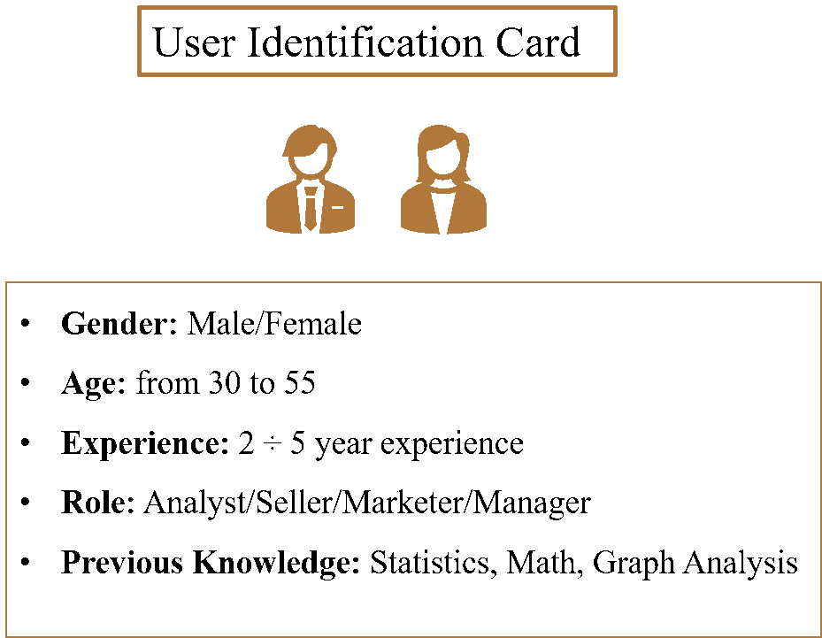
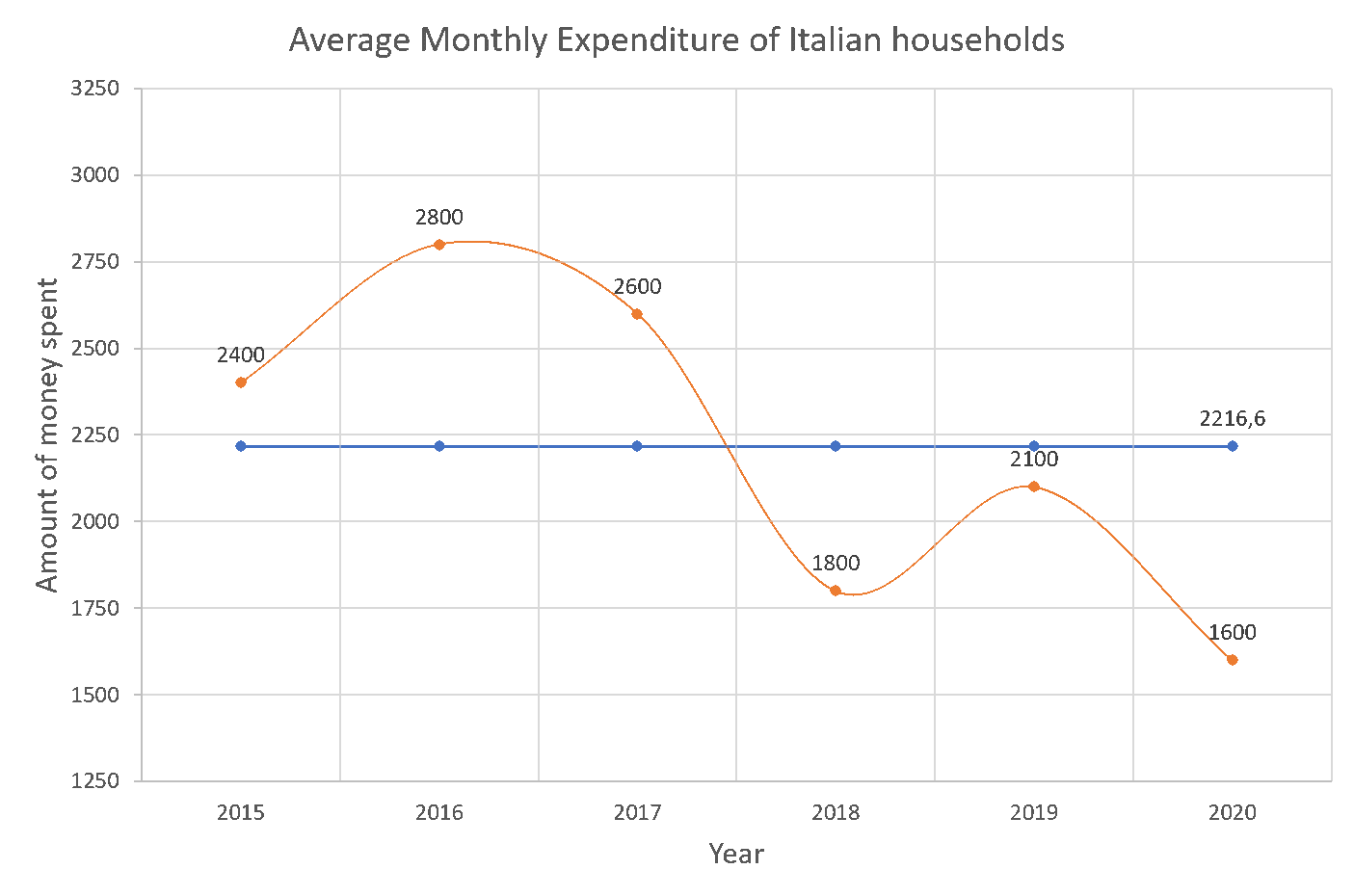
Figure 2. Example of Identification card.
Let’s just make another example! Take a look at Figure 3. If you remember, from our previous article, this was one of the options for better showing magnitude in expenditures of Italian households. If we think to a possible audience to deliver this work, we may think of any reader with form recognition capacity, dimension evaluation capacities, maybe an adult with fixed expenditures who may understand the inner meaning of the plot.
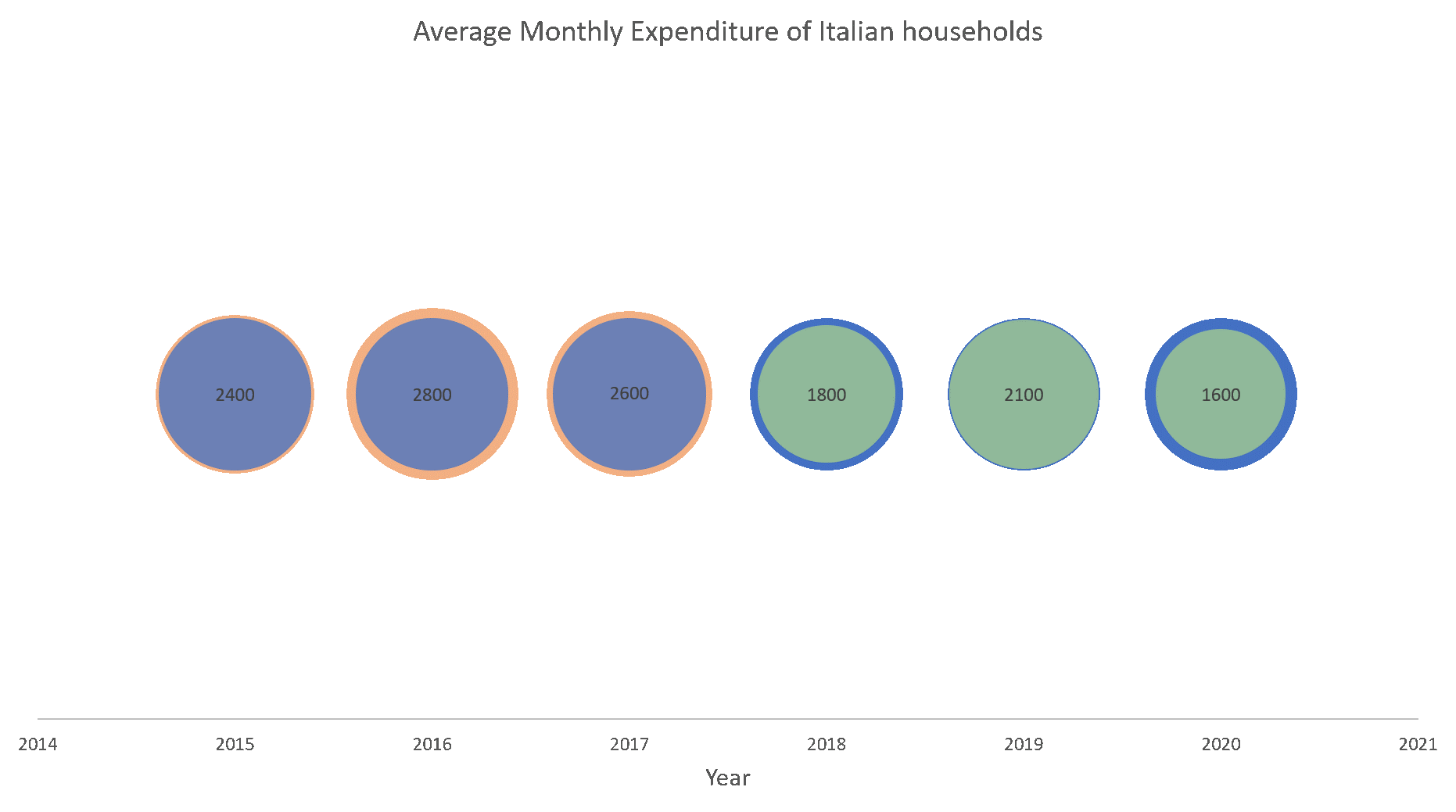
Figure 3. Plot showing the magnitude of expediture of Italian households.
But what if we want to deliver the same message in an even more intuitive way? What if we want to make clear that we are talking about money spent by families over years? How can we deliver the message in an extremely familiar way? Look at Figure 4, what do you think about it?
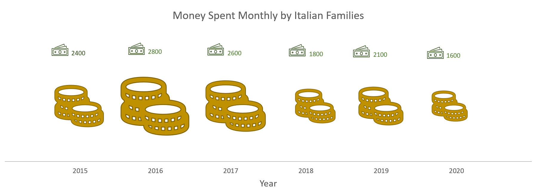
Figure 4. Plot showing money spent over years by Italian families.
With these simple examples we wanted to show you that the same message may be delivered in different ways, depending on who your reader is, how technical you want to be, how specifics are important rather than the underlying message.
As we already said, the perfect visualisation doesn’t exist! You have to find the better compromise among all the variables that may separate you work from your reader’s comprehension. Put everything on the plate and find the best possible solution to achieve your goal, every detail counts!
In the future notebooks we will talk about the last two, more technical, rules to design a good Data Visualization. In the next article we will focus on the star of Data Visualization, data! Keep following us to know more about “The world is data rich, but information poor.”
By Valentina Sale, Filippo Chiarello e Vito Giordano