


Here we are with the last, but not least, rule of this “magic” journey towards the design of a good data visualization! After talking about continuous changes (The Magic of Design in Data Visualization), questions (The Childish Side of Design in Data Visualization), empathy (Empathically Design in Data Visualization), and data (Data the Protagonist of Data Visualization), we now want to take you into a different dimension, that one concerning our inner processes, whose “head” is the brain!
To this purpose, the last quote we want you to focus on is the following, “It’s like you feel, not like you think”, which is the title of a song of an Italian musician, Carmelo Siracusa.
We have borrowed this quote to express an important concept that may be unknown to most people. As humans we think of ourselves as rational beings, basing our choices and decisions on logic but, instead we are mostly leaded by senses, perceptions, and irrationality. Rational cognitive processes are slow and energy consuming while irrational ones are fast and not energy consuming. There is, among the others, one sense that is fundamental in humans, that is sight. We base a large part of our understanding and perception on it. Vision is a fast process, reasoning is slow but, deep inside the mind, seeing and understanding are intertwined processes, we understand because we see.
This rule, indeed, is based on cognitive aspects that go beyond the mere production of a graphic representation. When designing a data visualization, we must try to take advantage of the strength of the visual functions and avoid the disadvantages of the cognitive functions. There is therefore a need to minimise the amount of thinking involved in the activity of reading and interpreting data and simply let the eyes do what they do best.
For the last time, we provided you with a quick list of steps to follow to put the rule into practice:

Figure 1. Step to follow.
The first step concerns the selection of the type of plot to use in order to vehicle your message and to implement the function you chose in the previous rules. With this first step we want you to understand that not all the plots are well suited to all the messages, functions, and audiences, so you need to select the right one. Taxonomies are good tools to get familiar with the different types of plots and their best applications.
Once the plot has been chosen, it is necessary to pay attention to the aesthetic details, which do not serve to make the graphic more attractive but to strengthen it. The purpose of a graphic representation is not to be beautiful for the mere satisfaction of the eye, but to be understandable and only then to be beautiful, or possibly to be beautiful for its functionality. Colours and shapes, in fact, play an important role in the final result of a data visualisation, as they act and influence the eye and consequently perception and understanding processes. This is because, as we have said, vision is fast, and reasoning is slow. For this step, it may be necessary to learn more about some cognitive and neurological processes that are triggered in our mind when it is stimulated by different visual elements.
The third step concerns the insertion of textual information to accompany numerical and visual data. Textual information is fundamental not to leave anything to chances. While you audience is looking at you work, it needs not to be misled by missing information. Every aspect of the visualisation that may be misunderstood or that is relevant to the comprehension of it needs to be explicated by textual information. To summarise, with this step you need to offer your audience with all the collateral information they may need to perfectly understand what they are looking at and to be able to make their own hypothesis and draw their own conclusions.
Finally, when producing a data visualisation, it can be tempting to overload the work, with too much information, too many colours, too much data, different shapes and so on. On the other hand, it can be tempting to dig too much into the data and offer the audience information that has a very low granularity. This is when you need to take a step back and find the right balance between completeness and accuracy. Start with the assumption that you cannot put everything into one representation. Instead, you have to find the right proportion between everything your audience needs to understand what you are showing them (completeness) and the sufficient level of detail of your information (accuracy). It does not always help to say everything or be extremely specific, the truth is in the middle!
To end our journey, we want to leave you with the last practical suggestions to improve your plots and representation. Let’s take our examples one more time:
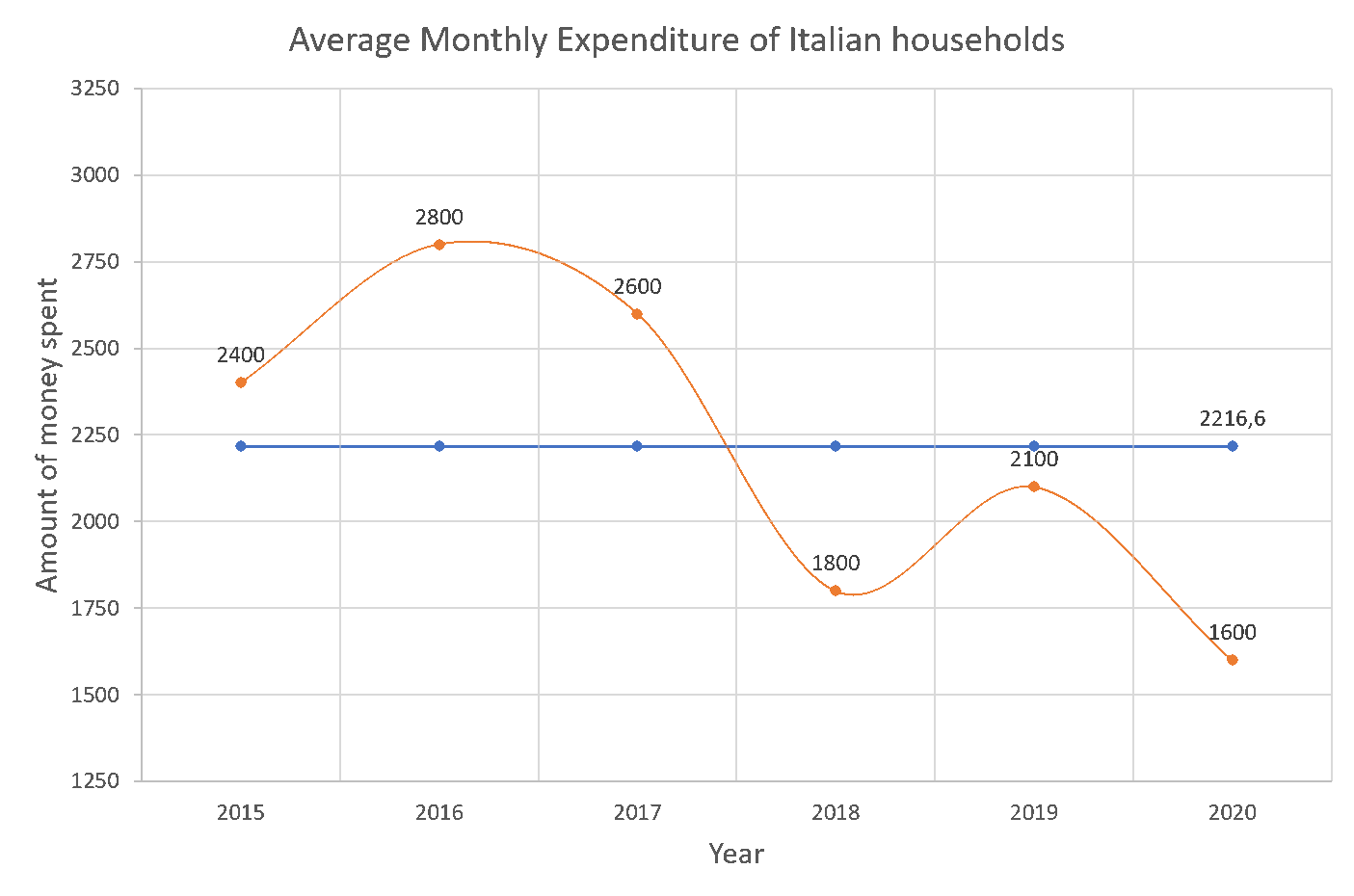
Figure 2. Line chart.
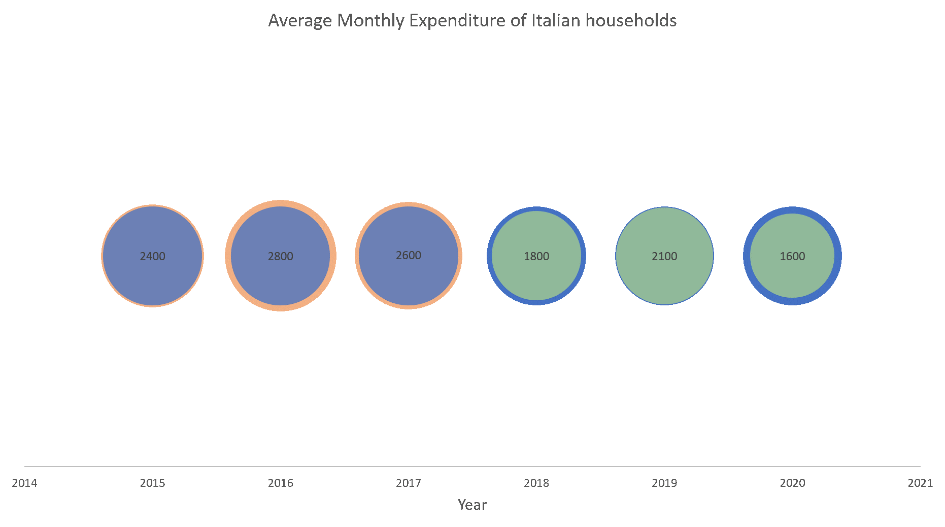
Figure 3. Plot showing magnitude over years.
How do you think we can improve them applying the last rule we described above? Both the plots carry several mistakes, as we said in our first notebook, now it’s time to discover and solve the last ones left! The first representation misses some fundamental textual information, and the ones present are far too tiny to be clearly seen. Remember to always specify the unit of measure on the axis, insert a legend if there are different colours used, or different types of elements that are not easily identifiable and try to make the labels understandable and visible.
That’s what the plot looks like with a few improvements:
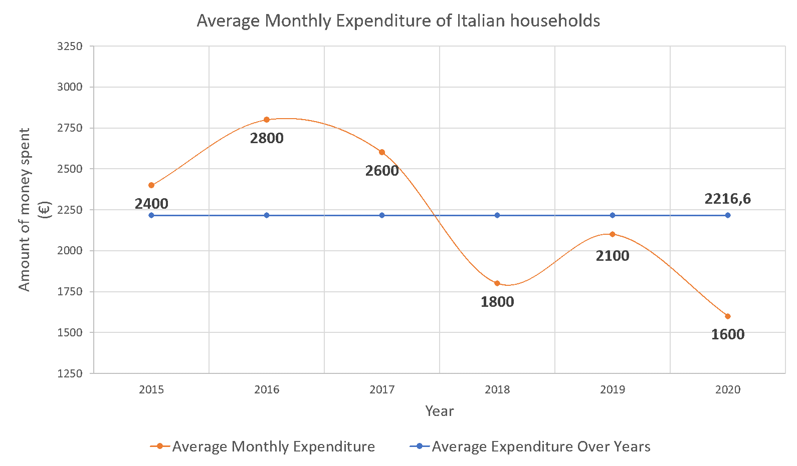
Figure 4. Line chart improved.
The second plot, instead, carries some mistakes concerning colours and shapes. It has been studied that circular shapes are not well understood and assimilated by humans, that’s because we are able to compare only one dimension at a time (for further information you can read the book of Alberto Cairo “Functional Art, The: An introduction to information graphics and visualization”[1]). Circles deliver the message that their area is the size to make a comparison on, but we tend to compare them as we would do with bars or lines, on one dimension only, like their diameter. To mitigate this problem, it is preferable to use linear objects to show differences in magnitude.
Concerning colours, if you want to use them with meaning, you have to make it clear what this meaning is. In this case, it is possible that red, green, and blue have some sense, but it is not well explicated, leading to misleading and confusion. Let’s see how the second plot looks like with a different “face”:
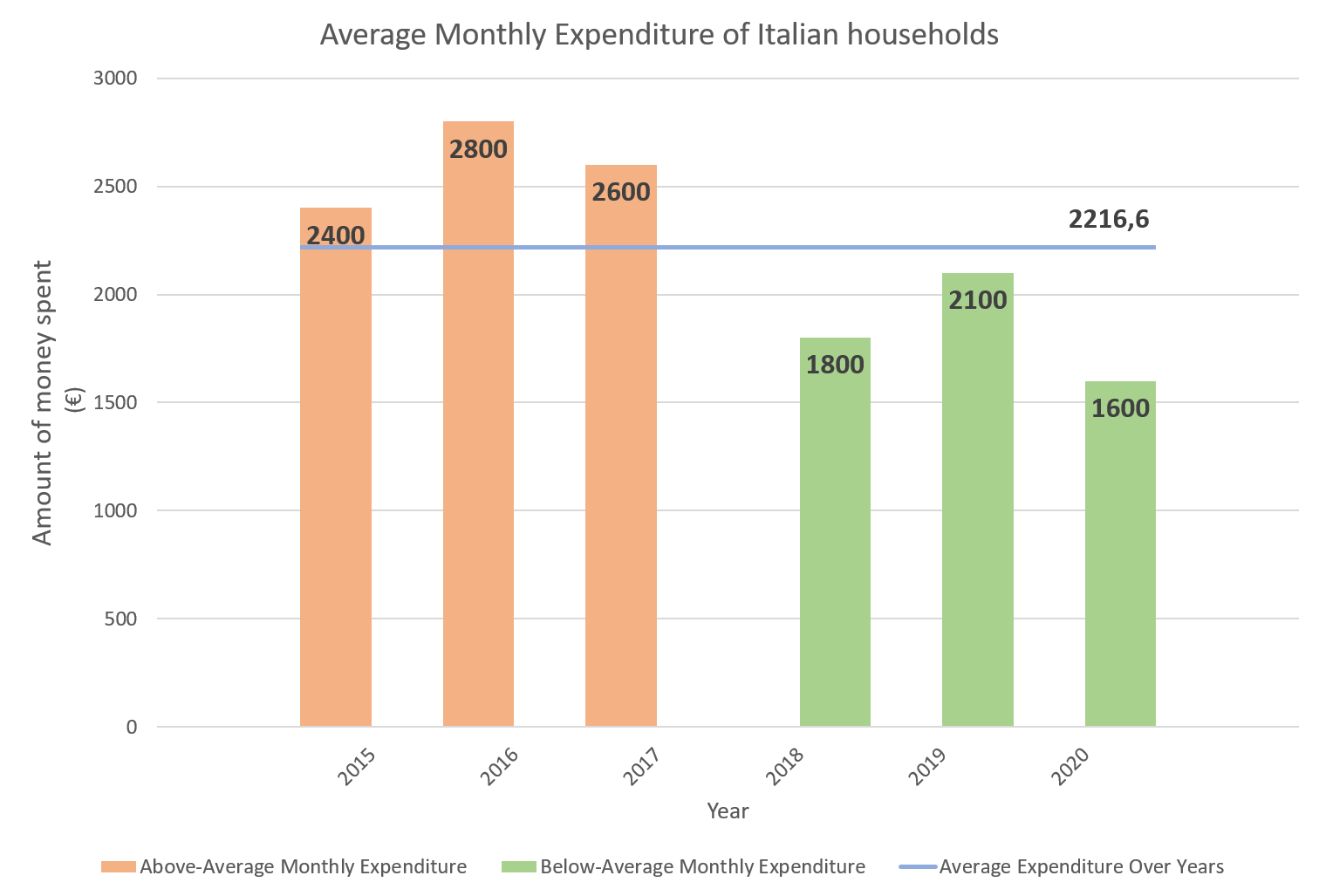
Figure 5. Bar chart improved.
The information offered is the same, but the impact and the understandability is different!
We arrived at the end of our journey, that’s it! Before we go, just remember that the perfect, most beautiful, error-free visualisation doesn’t exist! The usefulness and functionality of a representation can only be assessed within the context of the type of data, the questions to be answered and the nature of the audience. The more precise you are in defining those aspects, the fewer suitable options you will have to represent the data.
We hope you enjoyed this trip as much as we do, and we hope we have left you with some valuable tricks to use in your future data visualizations!
[1] http://www.thefunctionalart.com/
By Valentina Sale, Filippo Chiarello e Vito Giordano